Case Study
SiteCurve
Role
UX/UI Designer
Timeline
5–6 Months
Tools
Figma, Balsamiq
Type
SaaS Product
My Contribution
High-Fidelity Mockups
Designed pixel-perfect, production-ready screens covering all key product areas and states.
Component Library
Built a scalable Figma component library with defined variants, states, and reusable styles.
Annotated Screens
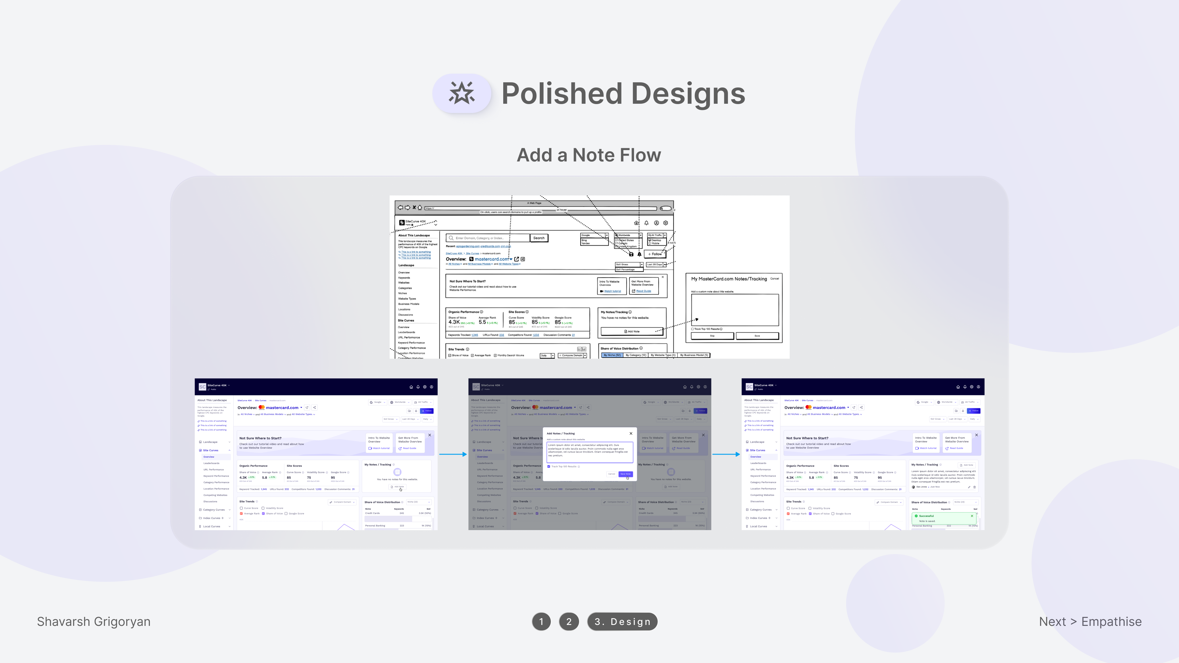
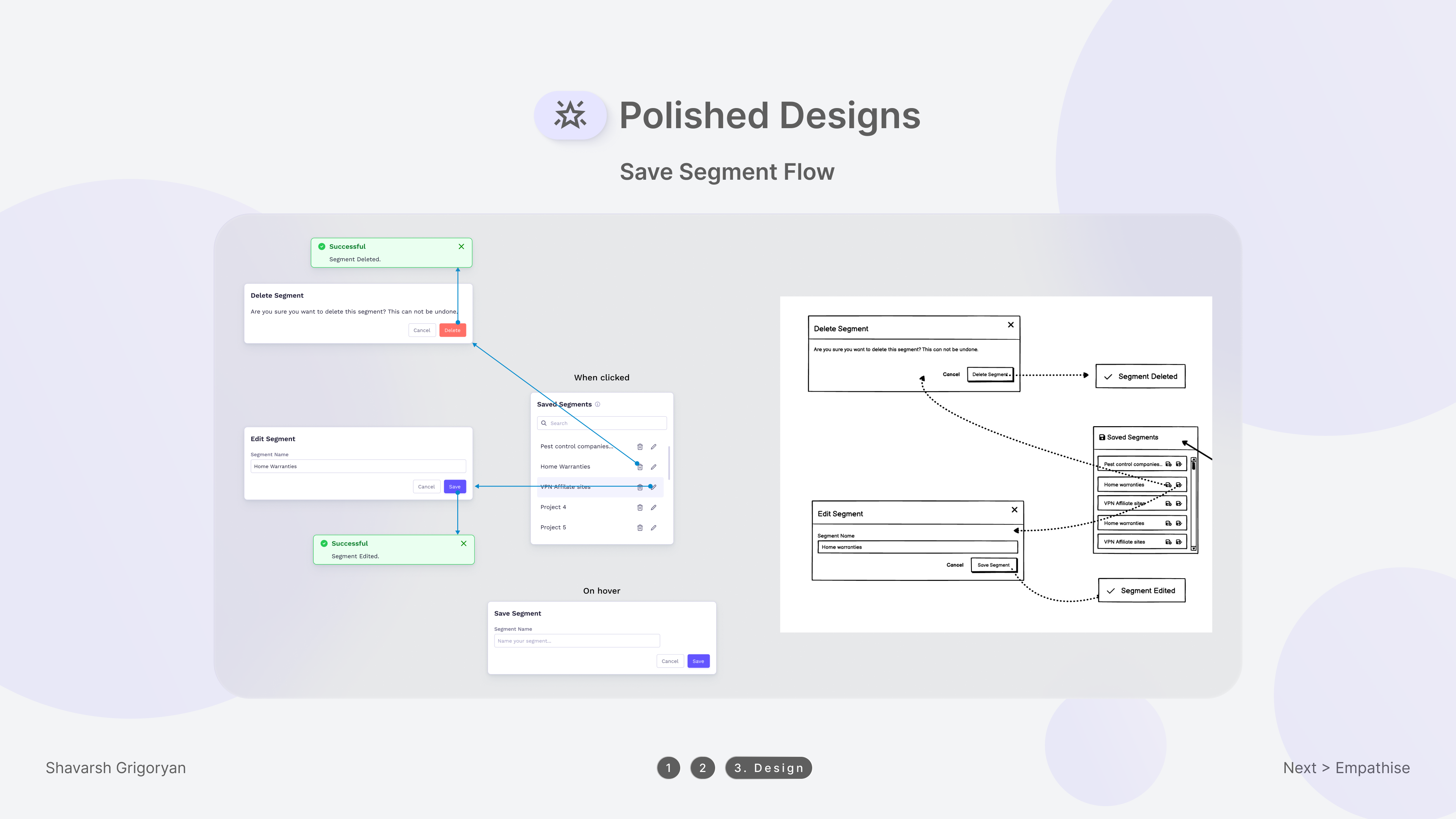
Delivered detailed annotations for every screen, documenting behavior, interactions, and edge cases.
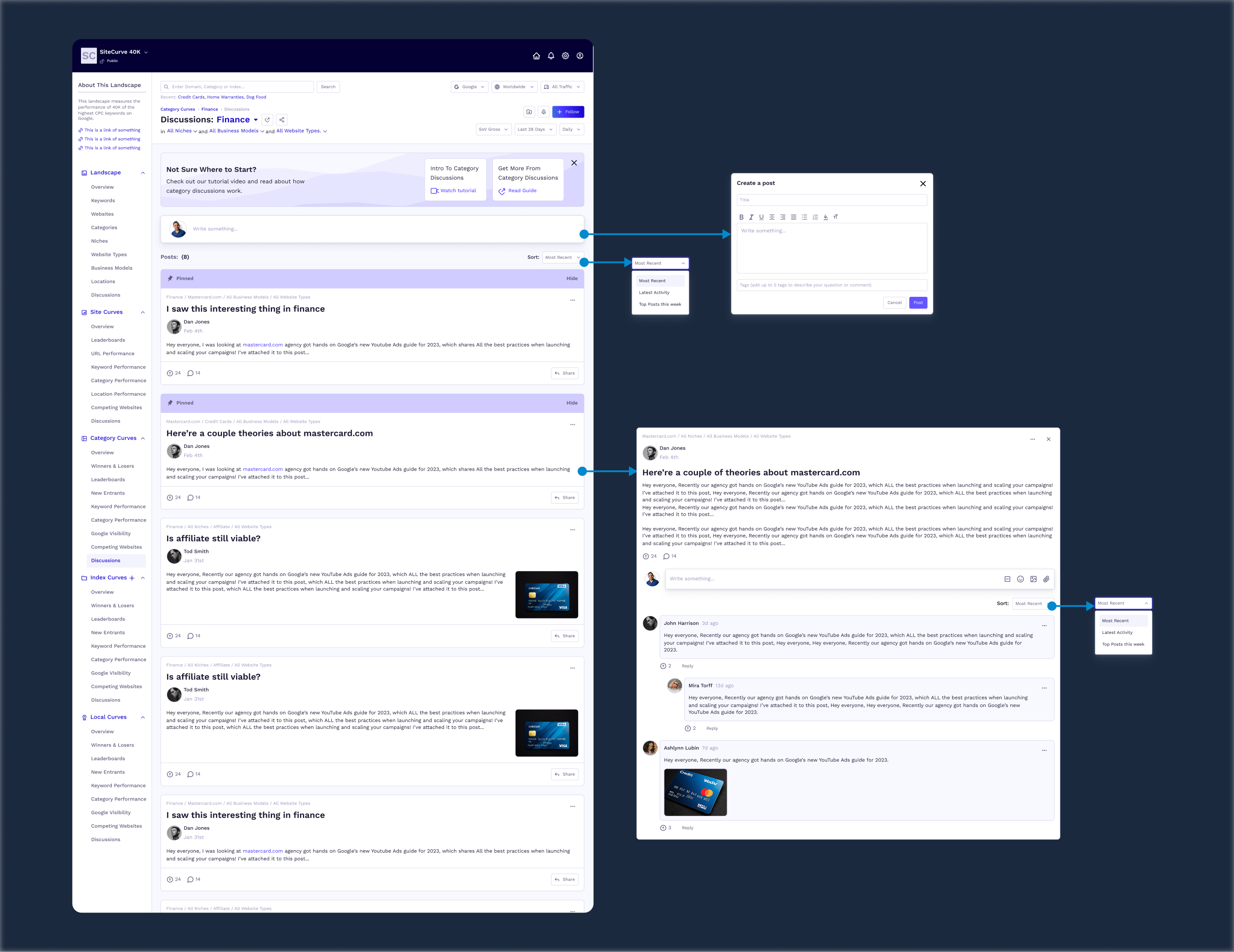
Documented User Flows
Mapped out complete user flows covering primary tasks, navigation paths, and decision points.
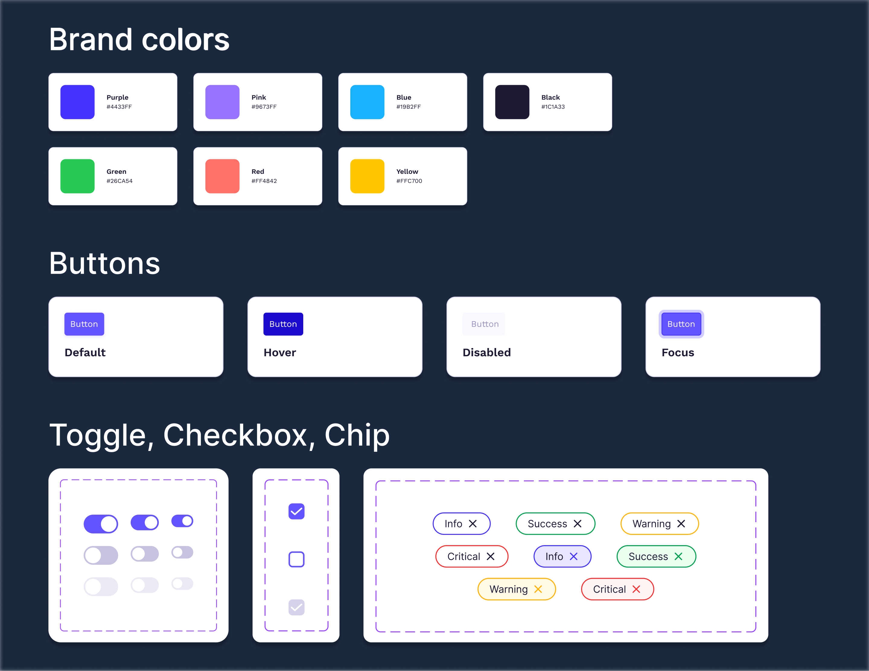
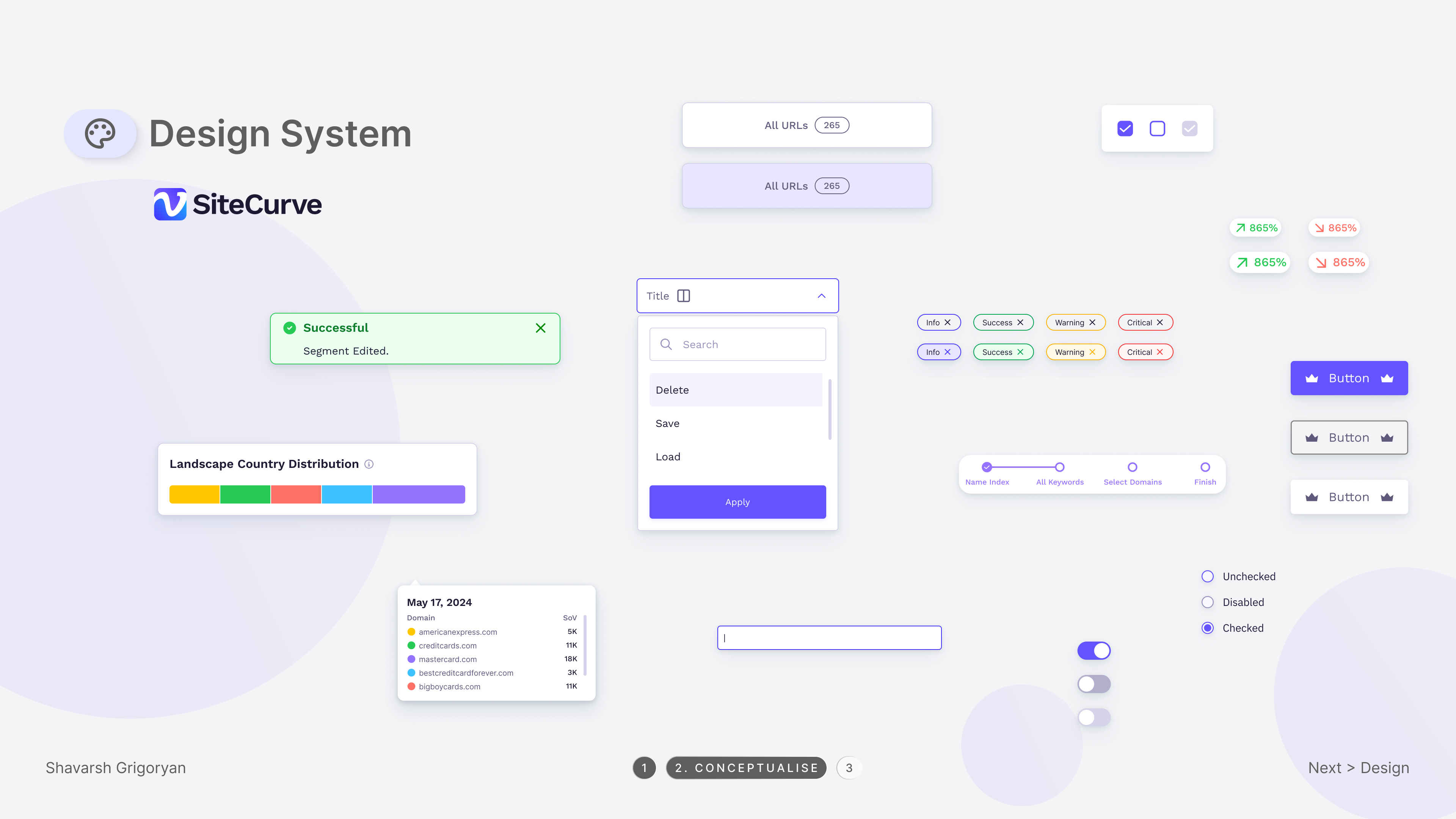
Design System
Established a consistent design system with color tokens, typography scale, spacing rules, and iconography.
Developer Handoff
Prepared developer-ready files with specs, component notes, and interaction details for a smooth handoff.
00
Impact
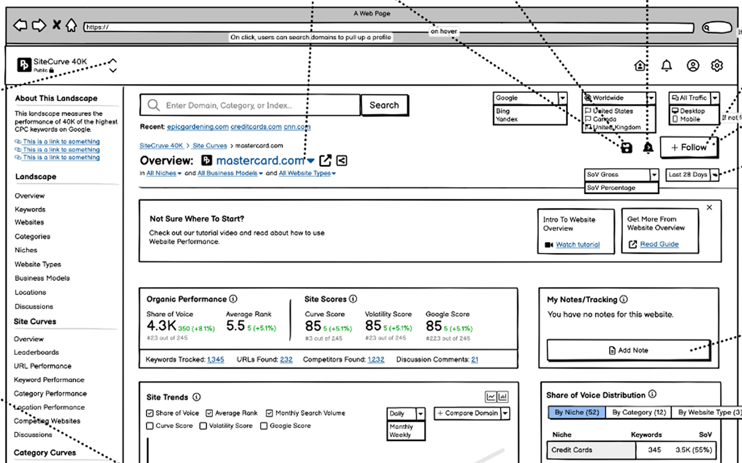
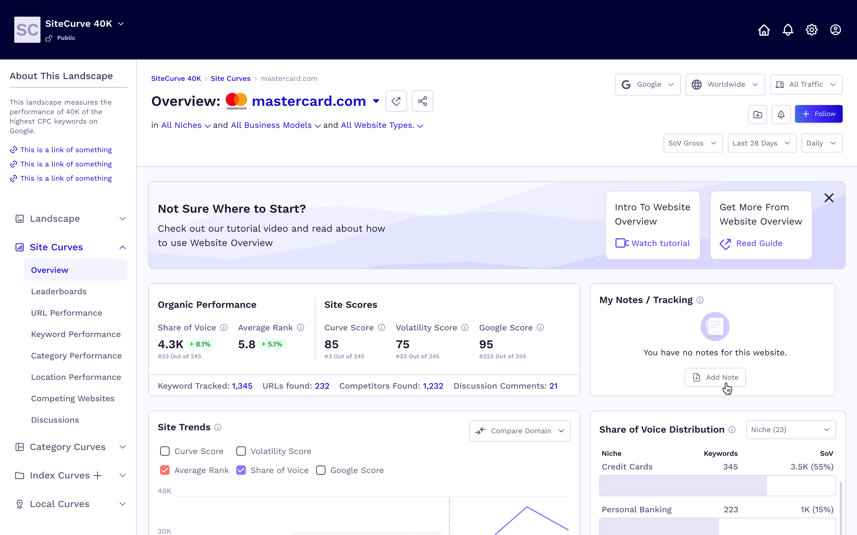
The project began with rough Balsamiq wireframes and evolved into a fully polished, production-ready Figma design. The transformation reflects the full design process — from low-fidelity structure to high-fidelity visual design with a consistent component system.
Before — Balsamiq Wireframes
After — Figma High-Fidelity
01
Context
SiteCurve is a SEO intelligence platform designed to help users monitor and analyze website performance across various metrics. Its key features include:
- ▸Tracking search visibility
- ▸Identifying ranking shifts
- ▸Facilitating discussions among users
02
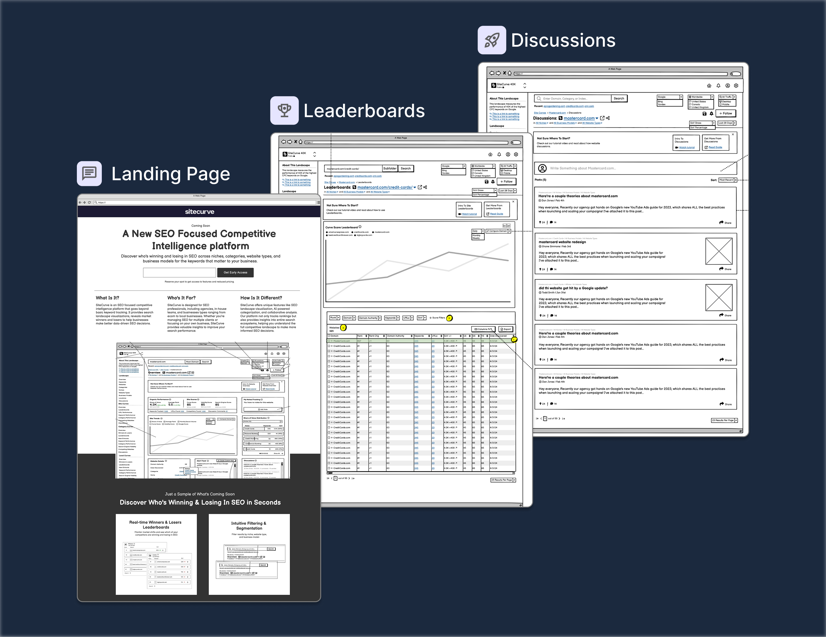
Key Features
Winners & Losers Leaderboards
Users can monitor websites that are experiencing significant ranking changes across various search engine results page (SERP) features.
Market Leaders Analysis
The platform allows users to view top-performing websites categorized by niche, site type, and business model, offering insights into dominant players within specific landscapes.
Emerging Competitors Tracking
Users can discover new entrants in their market space and assess how these emerging competitors might impact their own rankings.
Unique SEO Metrics
SiteCurve.com provides specialized metrics such as share of voice, volatility scores, Google presence scores, and a proprietary Curve score to evaluate website performance comprehensively.
03
The Users
- ▸SEO Professionals — Track website rankings, analyze search visibility trends, identify ranking shifts. The platform helps them with competitive analysis, keyword insights, and SEO performance monitoring.
- ▸Digital Marketers — Monitor the effectiveness of their campaigns, measure organic traffic performance, gain insights into search engine trends. The platform provides actionable data to refine marketing strategies.
- ▸Content Creators — Analyze how their content ranks on search engines, identify content opportunities, and optimize their work for better visibility. It helps them understand what type of content performs well and why.
- ▸Business Owners — Track their site's SEO health, gain insights into customer search behavior, and measure how their online presence impacts their business. This allows them to make data-driven decisions for growth.
04
Problems with original mockups
- ▸Loss of Intent When Moving From Sketched UI to Structured Layout — The client's original Balsamiq sketches carried implicit design decisions that were difficult to preserve when translating into structured, scalable Figma layouts. The original intent was getting lost in translation.
- ▸Component Mapping Issues — Balsamiq placeholders required full redesign into interactive Figma components with clearly defined states, variants, and styles — there was no 1:1 mapping between the wireframe elements and production-ready components.
- ▸Missing Interaction Details & User Flows — The original mockups lacked documented interaction states, transitions, and edge cases. Key user flows were incomplete, making it unclear how users would navigate between features.
05
Competitors
- ▸Prior User Research — The client had already conducted user research before coming to me, providing a solid foundation of user insights to build on.
- ▸Validated Decisions — All design decisions throughout the process were validated with the client, ensuring alignment at every stage.
- ▸Known Target Users — He knew the target users, their behaviour, and expectations — which shaped the direction of the UX from the start.
- ▸Discovery Calls — A few hours of calls with the client to learn about the product idea, goals, vision, users, competitors, and problem space.
06
Color palettes, branding, visual elements
- ▸Research & Feedback — Conducted research, presented options, refined the approach based on client feedback, and provided supporting screenshots.
- ▸Visual Elements — Used typography, color palette, icons, buttons, and imagery to enhance usability.
- ▸Layout & Structure — Ensured proper spacing, alignment, and responsive grid systems.
- ▸Interactions — Applied animations and transitions for a smooth, engaging user experience.
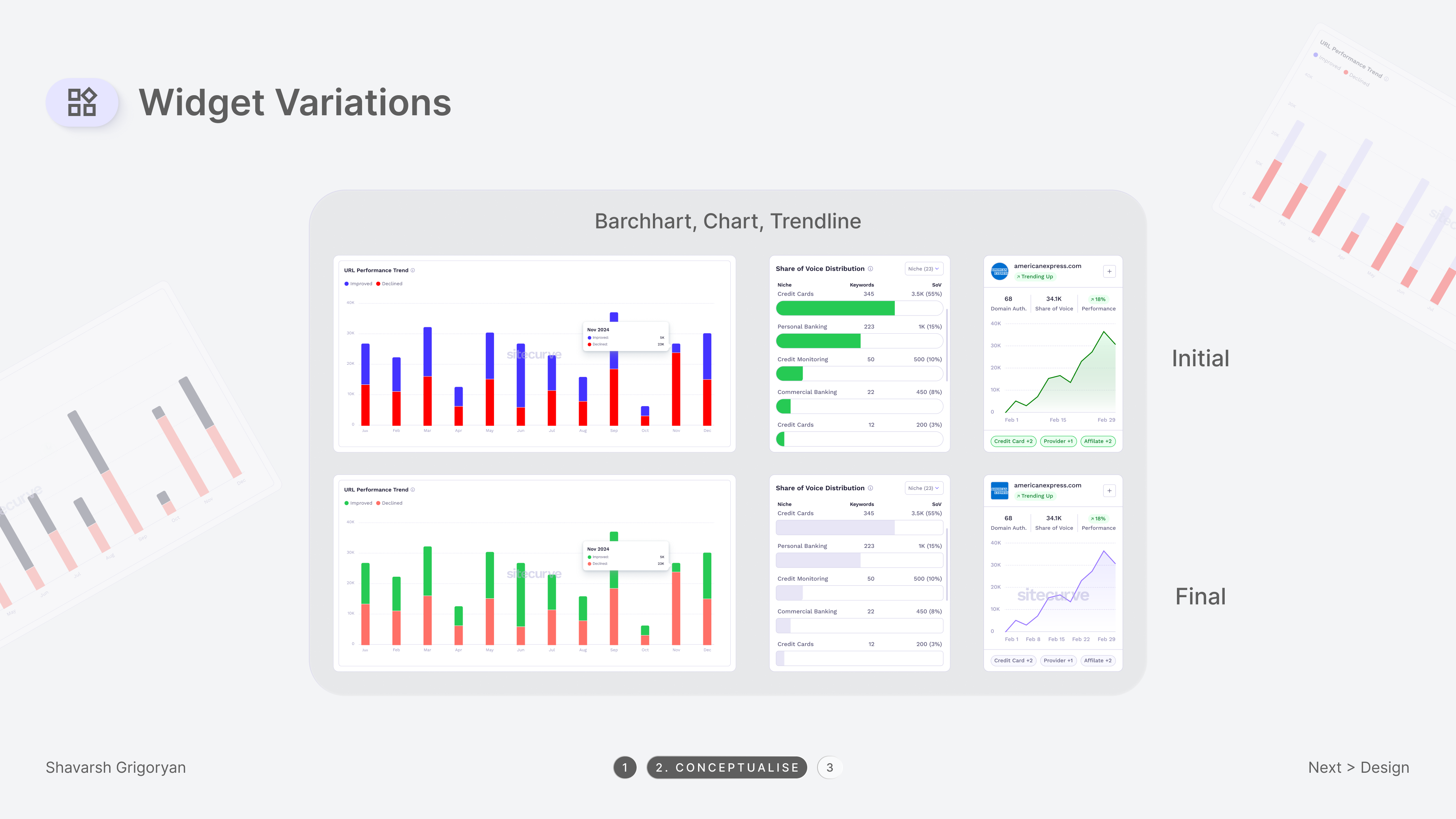
07
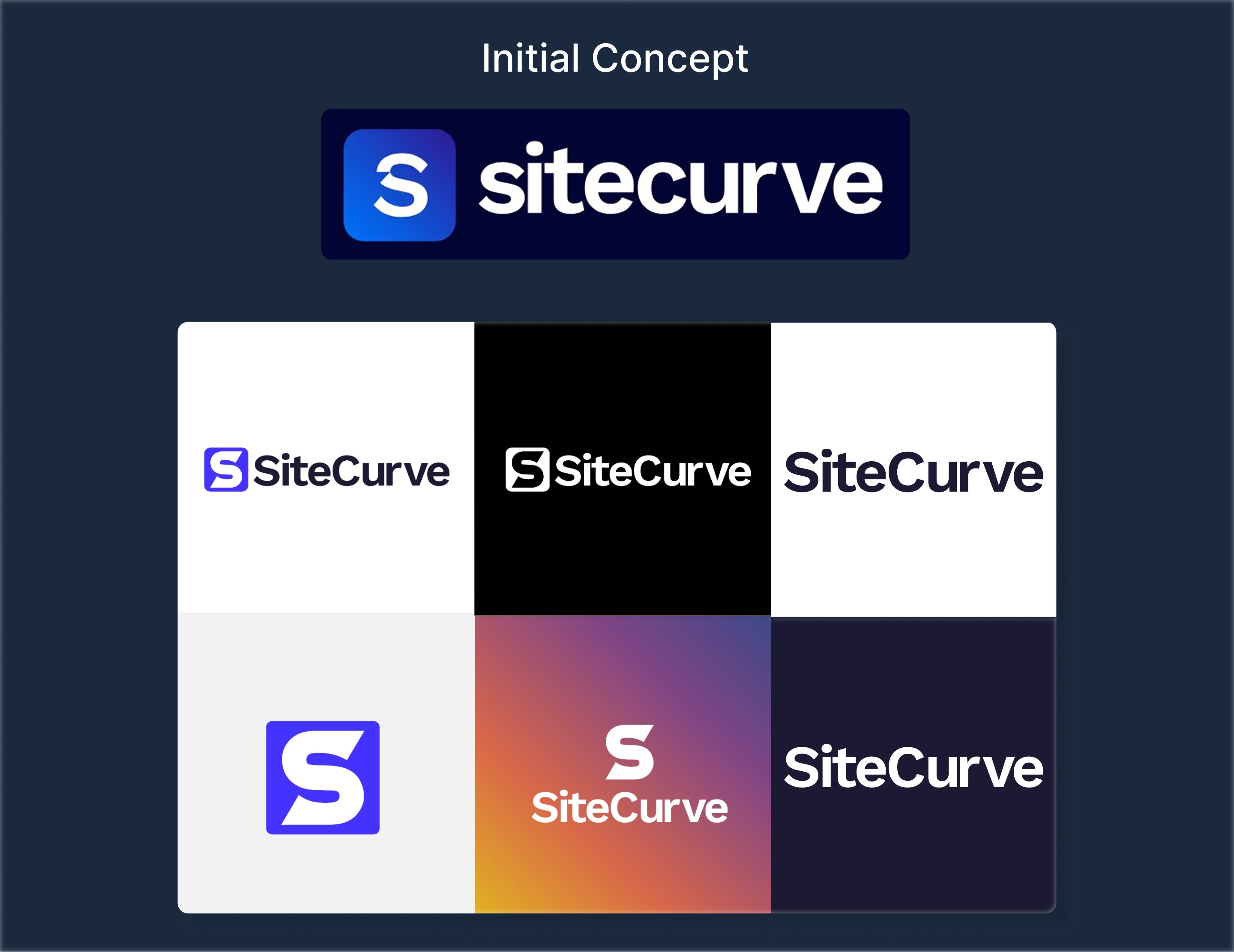
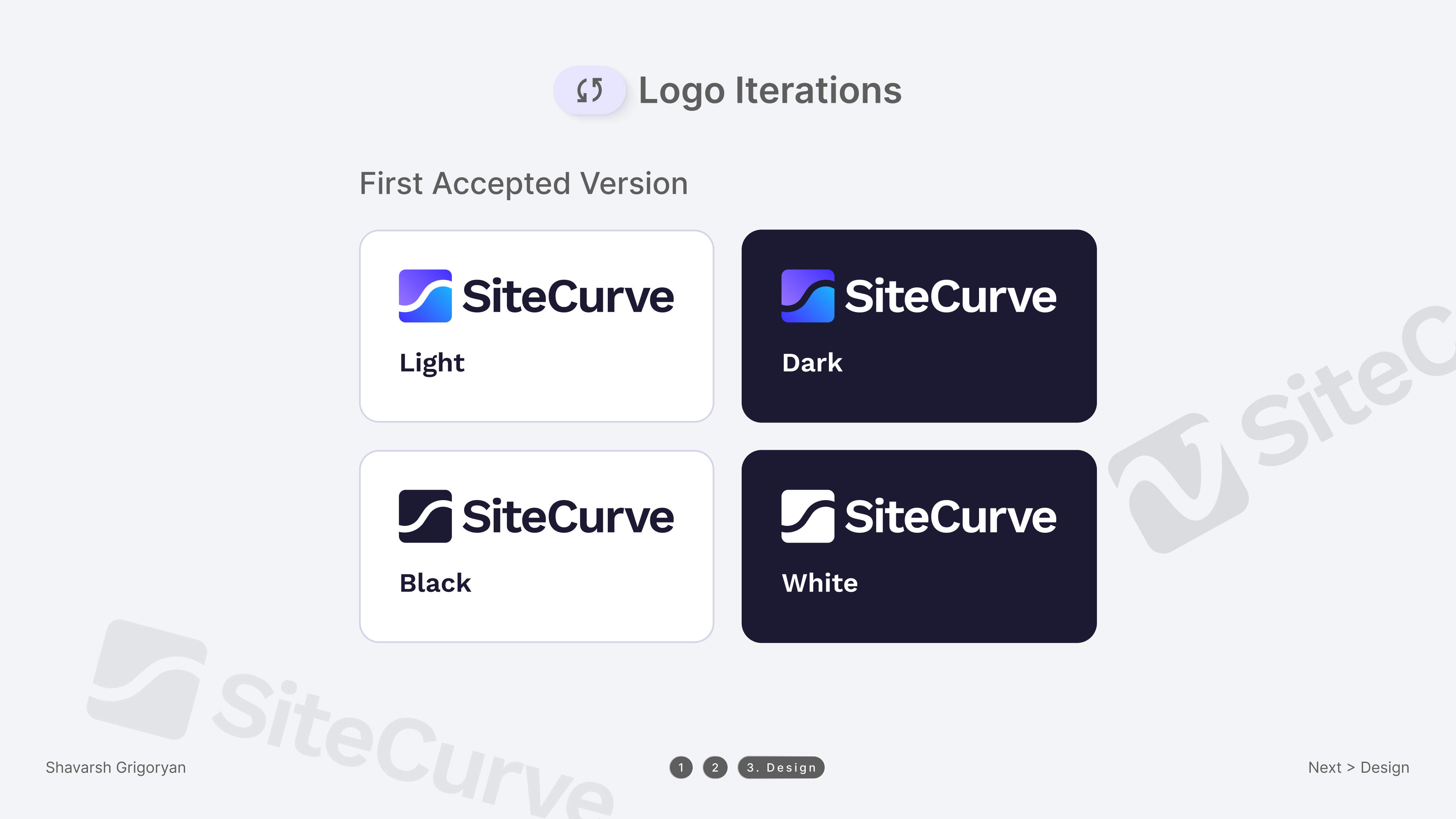
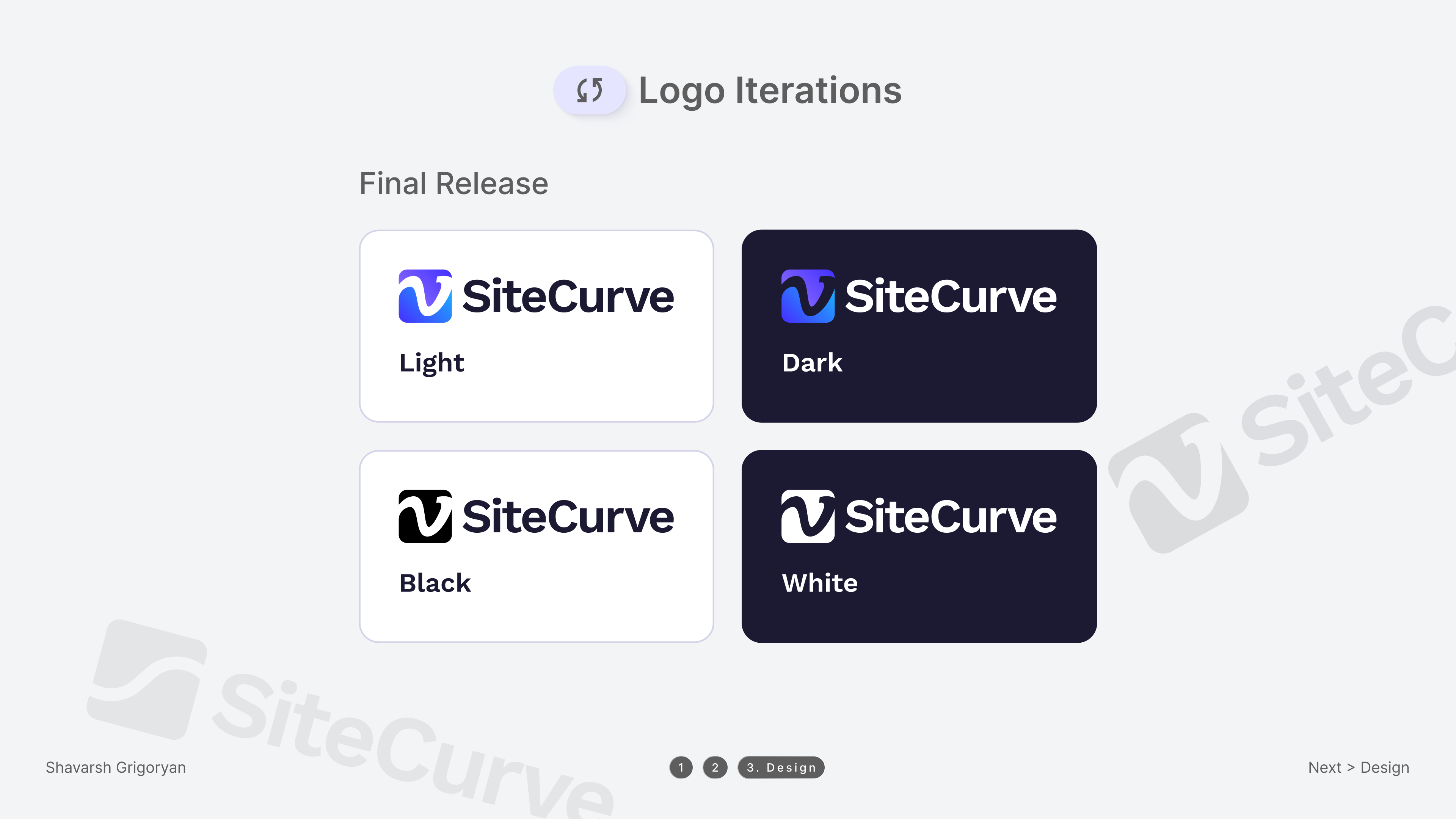
Logo Iterations
The logo design process involved multiple iterations to refine the visual identity and ensure it aligned with the brand's vision.
- ▸Initial Concept — Explored shapes, typography, and symbolism to establish a strong foundation.
- ▸First Accepted Version — Refined proportions, typography, and visual balance based on feedback.
- ▸Final Release — Applied color adjustments and scalability tweaks for clarity, versatility, and strong brand recognition.
08
Polished Designs
The transformation from the initial mockup to the final landing page focused on enhancing both visual appeal and functionality.
- ▸Refined Visuals — We improved typography, color balance, and spacing to create a more engaging and professional look.
- ▸Enhanced Usability — Adjustments in layout and hierarchy ensure better readability and intuitive navigation.
- ▸Improved Responsiveness — The design was fine-tuned to adapt seamlessly across different devices and screen sizes.
The final design successfully delivers a user-friendly experience while maintaining a strong brand identity.
09
Outcome
Delivered multiple design directions for the client to evaluate, incorporating their feedback iteratively throughout the process. The final result was a cohesive, production-ready UI with a clear design system that the development team could build directly from.
The client received detailed annotated screens, a component library, and documented user flows — everything needed for a smooth development handoff.