Case Study
Sentrys AI
A healthcare SaaS platform that helps U.S. medical practices avoid insurance claim rejections by validating claims before submission — catching coding errors, missed deadlines, and insurer-specific rule violations in real time.
Role
UX/UI Designer
Timeline
1 Month
Tools
Figma
Type
Healthcare SaaS
My Contribution
Wireframing
Translated client sketches and rough concepts into structured wireframes and validated layout decisions.
High-Fidelity UI
Designed polished, production-ready screens across all key features and interaction states.
Interactive Prototypes
Built Figma prototypes for client review across multiple iterations.
Impact
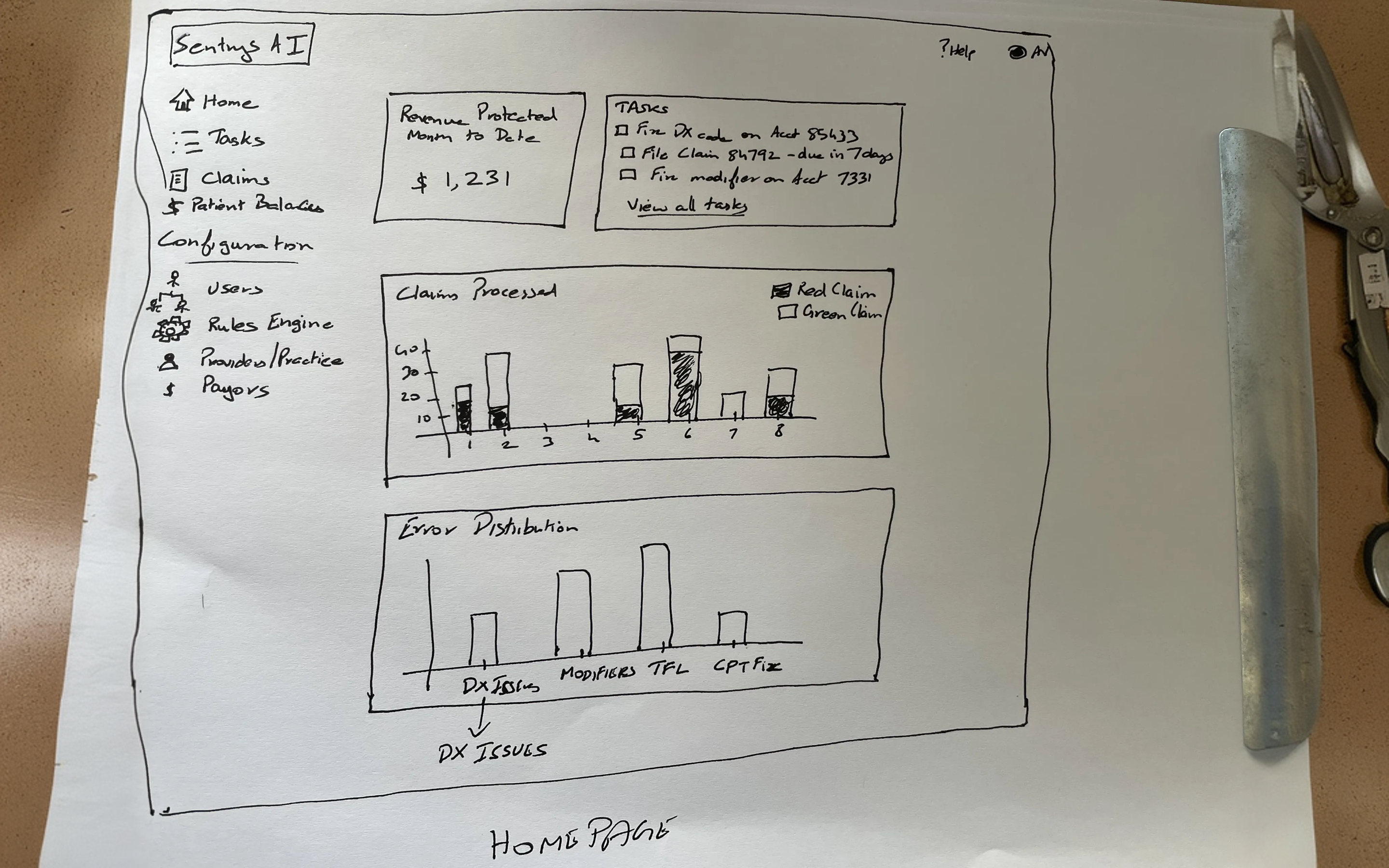
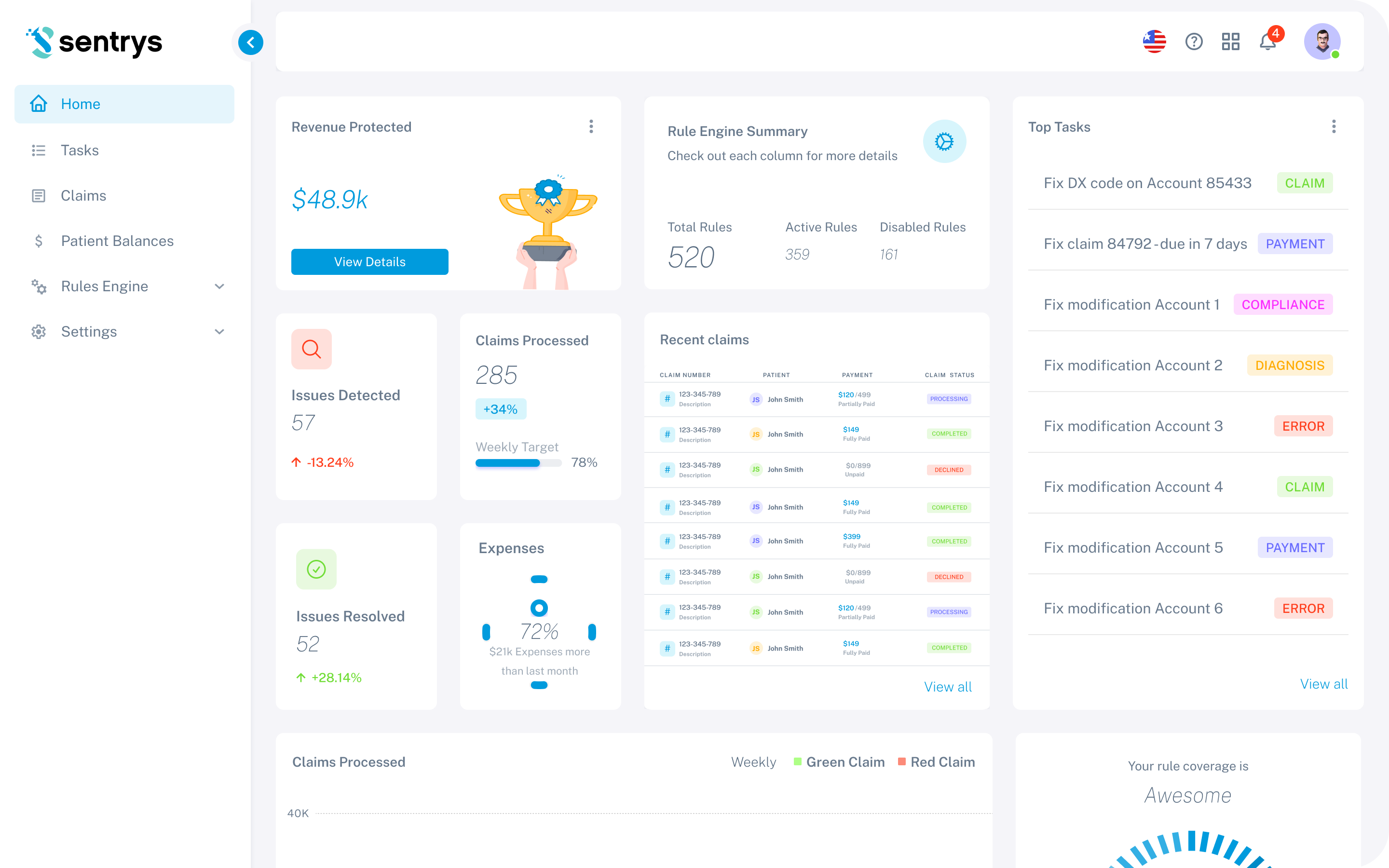
The project started from rough client sketches outlining the core concept. These were transformed into a structured, polished product through research, iterative design, and close collaboration with the client.
Before — Client Sketch
After — Final UI
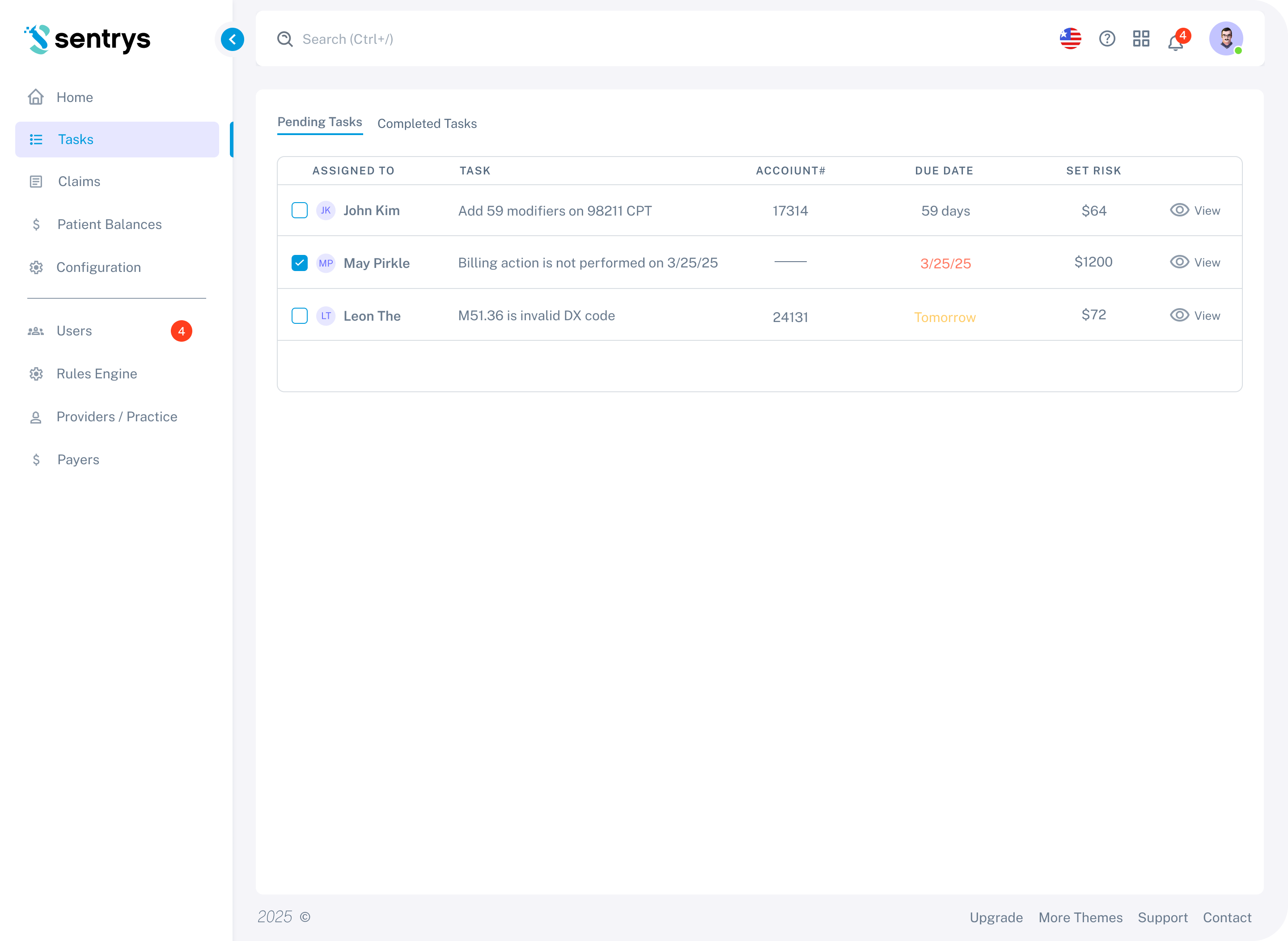
Tasks / Pending Tasks
The primary workflow view for billing staff — showing all pending tasks assigned across the team, with claim-level details, due dates, and risk amounts, enabling staff to prioritize and act on issues before they become rejections.
Iteration 1
First Concept
The first concept introduced a task-based view separating Pending and Completed tasks in two tabs. Each row surfaces the assigned staff member, the specific issue description, account number, due date, and the financial risk amount — giving billing managers a clear, prioritized view of what needs to be resolved before claims are submitted.
Client Feedback
Based on client review, tasks needed to be split into priority groups so critical issues wouldn't get lost in a flat list. Pagination was also required to handle large task volumes, and a completion confirmation state was needed to give staff clear feedback when marking tasks as done.
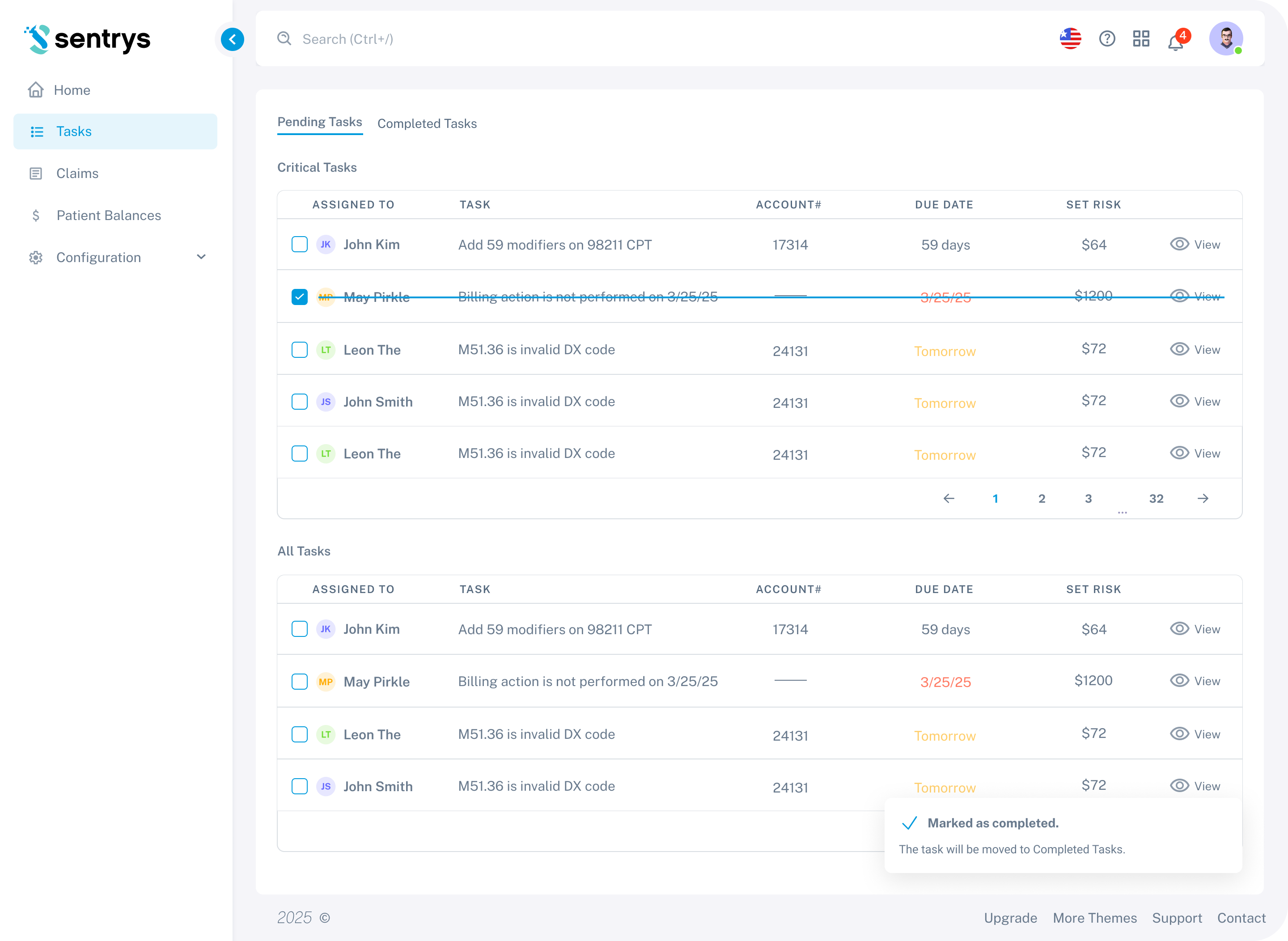
Iteration 2
Refined Based on Feedback
The second iteration introduced a two-tier task structure — Critical Tasks appear at the top as a prioritized group, followed by All Tasks below. Pagination was added to handle large task volumes. A "Marked as completed" toast notification was introduced to give staff clear feedback when resolving a task, and completed rows are visually struck through to indicate their status at a glance.
Client Feedback
Based on client review, the two-section layout felt visually heavy. The client requested a single unified list with inline filtering and the addition of a financial risk column to help staff prioritize by dollar impact.
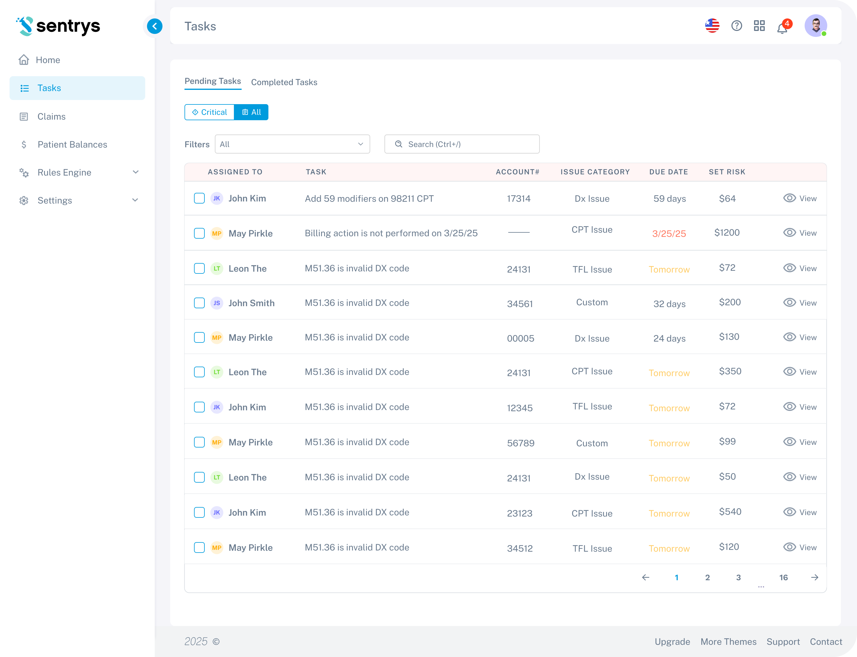
Iteration 3
Final Design
The final iteration replaced the split layout with a single unified task table. Priority filtering moved to inline pills — "Critical" and "All" — keeping the view clean without sacrificing prioritization. A SET RISK column was added so billing staff can immediately see the financial impact of each pending task. Overdue dates are highlighted in red for quick identification.
Rules Engine
The intelligence layer behind the platform — a configurable engine containing both global predefined rules and local custom rules per clinic, enabling flexible validation tailored to each practice's specific insurers and workflows.
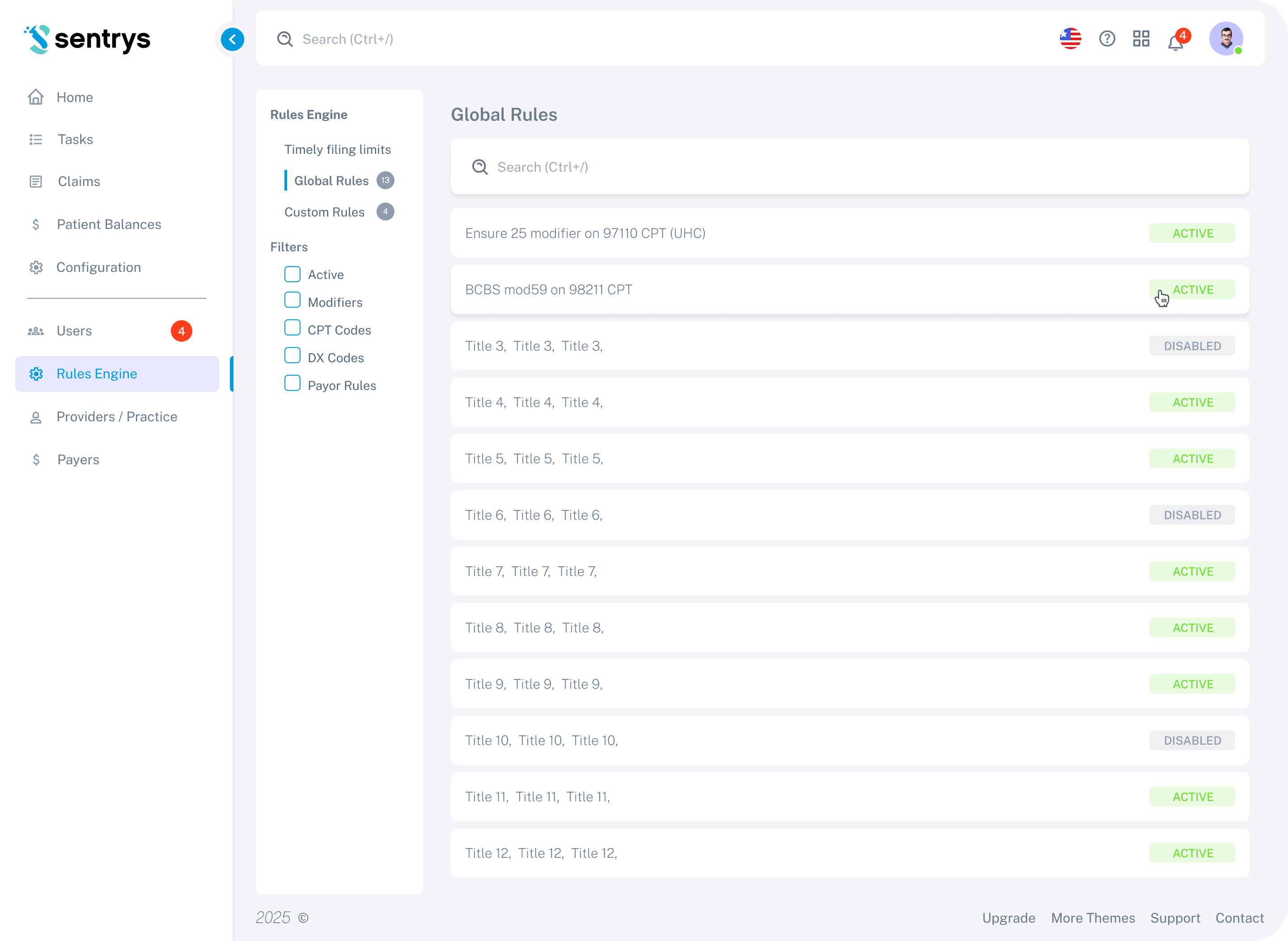
Iteration 1
First Concept
The first concept introduced a two-category structure — Global Rules and Custom Rules — accessible via a left sidebar. Global Rules are listed as individual rows with Active and Disabled status badges, giving administrators a quick read on which rules are currently enforced. A filter panel allows narrowing by rule type: Modifiers, CPT Codes, DX Codes, and Payer Rules.
Client Feedback
Based on client review, the separation between global and local rules needed to be clearer, and the rule creation flow needed simplification for clinic staff who are not technically experienced.
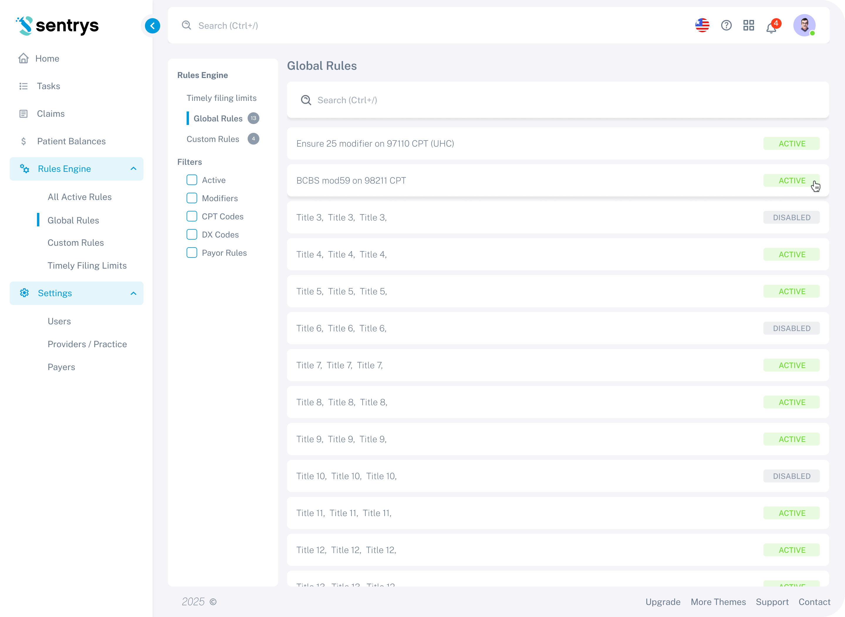
Iteration 2
Refined Based on Feedback
The second iteration expanded the navigation structure under Rules Engine — adding sub-items for All Active Rules, Global Rules, Custom Rules, and Timely Filing Limits — giving administrators direct access to each rule category without extra clicks. A Settings section was also introduced in the sidebar, covering Users, Providers/Practice, and Payers.
Client Feedback
Based on client review, the final round of changes focused on polishing the rule editor interactions and ensuring the layout worked well for clinics managing a large number of custom rules.
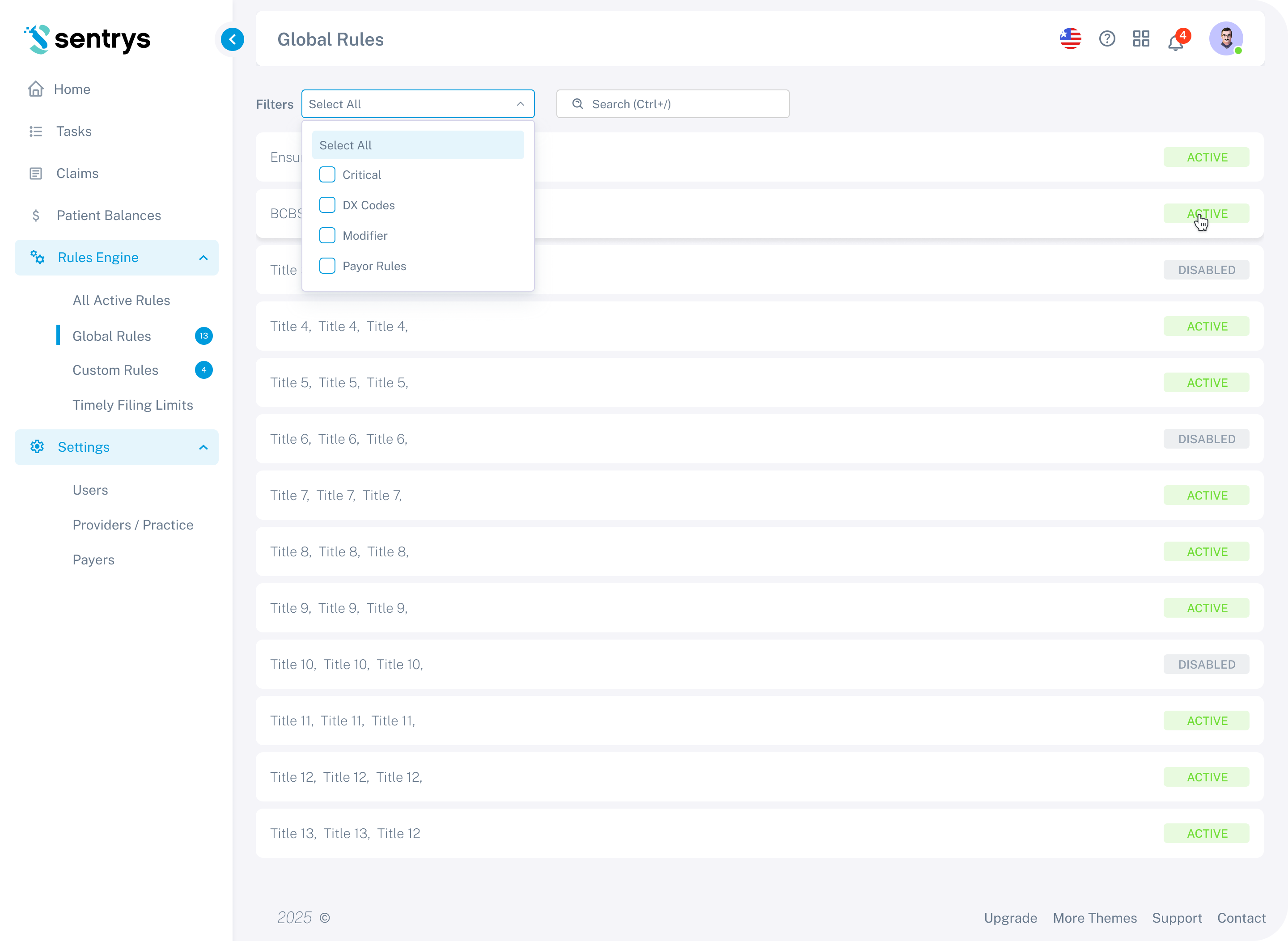
Iteration 3
Final Design
The final iteration moved filtering inline — replacing the sidebar filter panel with a compact dropdown at the top of the rules table, keeping the layout cleaner and reducing the number of UI elements competing for attention. Badge counters were added to the Global Rules and Custom Rules nav items so administrators can see rule counts at a glance without navigating into each section.
Outcome
The platform evolved from rough client sketches into a fully polished, production-ready product through a close iterative process. Each feature was validated through multiple rounds of client review, ensuring the final design closely matched the real needs of billing staff and practice managers.
The client received complete Figma files with interactive prototypes, annotated screens, a component library, and documented flows — everything needed for a smooth development handoff.