Case Study
DevGrid
An AI-native Engineering Operations Platform that transforms fragmented technical data into a live, self-maintaining system graph — giving enterprise teams full visibility into services, infrastructure, teams, and business goals.
Role
UX/UI Designer
Timeline
2023 — Present
Tools
Figma
Type
Enterprise SaaS
My Contribution & Impact
UX Research
Conducted research to understand how engineering teams navigate complex system data and what information they need most.
Wireframing
Explored layout concepts and interaction patterns before committing to high-fidelity designs.
High-Fidelity UI
Designed pixel-perfect, production-ready screens across all key features and states.
Interactive Prototypes
Built Figma prototypes to validate flows and share interactive designs with the client for review.
Design System
Established a consistent component library with tokens, typography, and reusable patterns for scalable design.
Concept to Reality
Translated the client's early-stage ideas and rough requirements into a structured, polished product through research, exploration, and iterative design.
Radar View
An interactive technology radar giving engineering leaders and platform teams a visual overview of their tech stack — mapping technologies across four adoption zones: Use, Trial, Assess, and Hold — with filtering by members and components.
Iteration 1
First Concept
The initial concept focused on surfacing the most critical system signals at a glance — State indicators, Sorting and filtering, and Assets — organized into a dense but scannable layout.
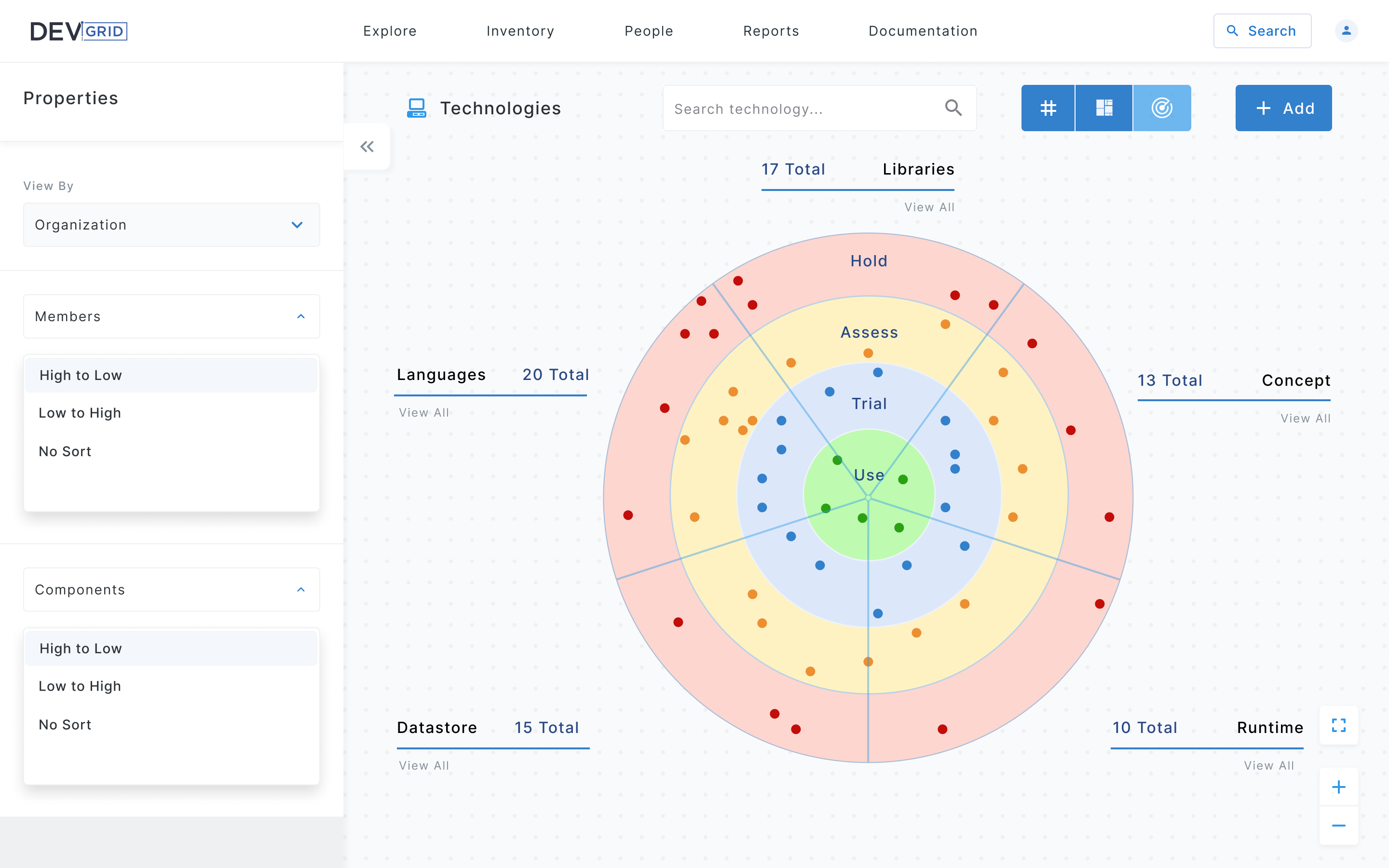
Client Feedback
Based on client review, the design was refined to simplify the filter structure, reduce visual noise in the side panel, and improve the radar's readability by introducing variable dot sizing to represent usage weight.
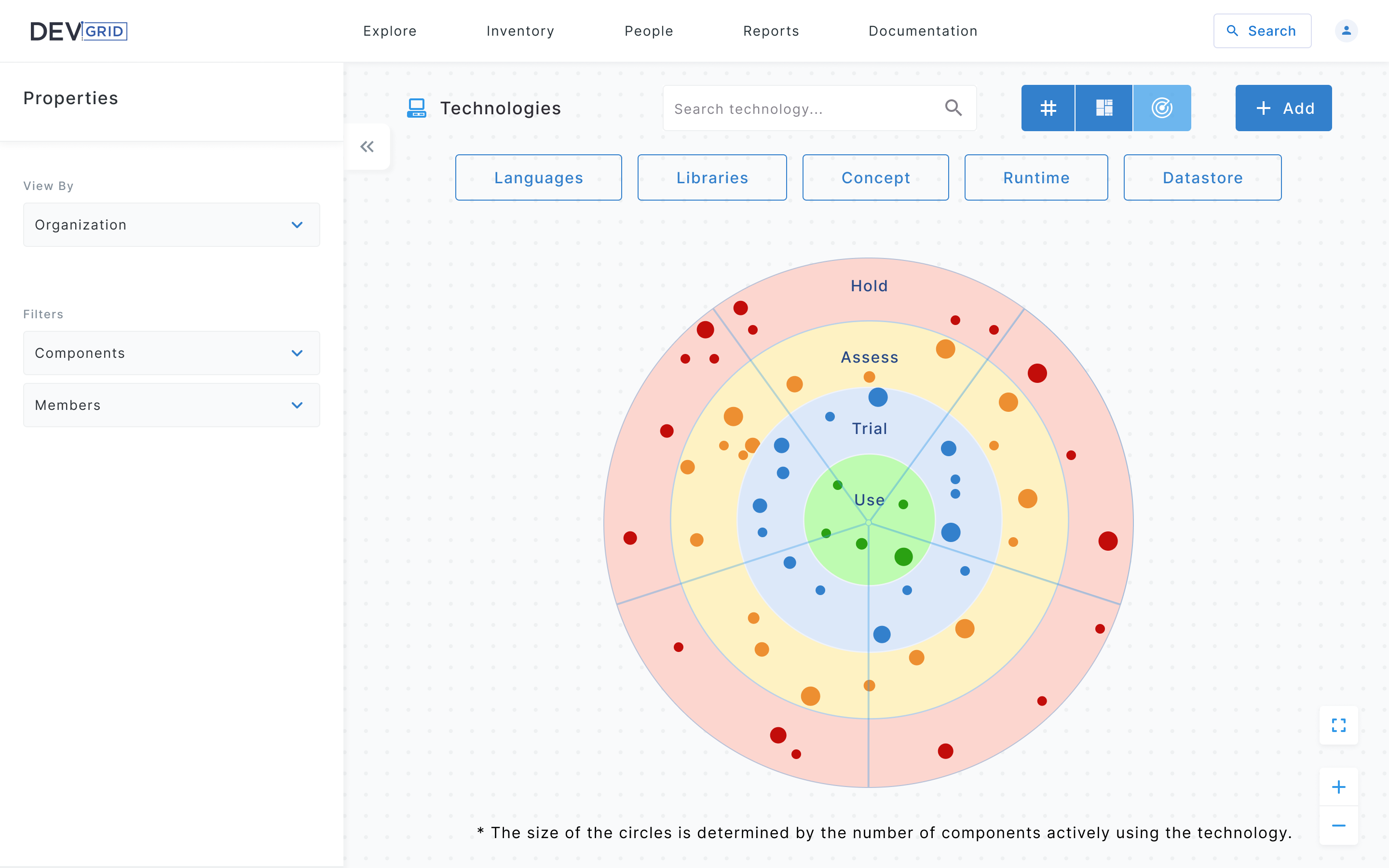
Iteration 2
Refined Based on Feedback
The second iteration addressed the client's feedback, refining the layout, improving information hierarchy, and adjusting the visual language to better match the platform's enterprise context.
Prototype
Interactive Prototype — Radar View
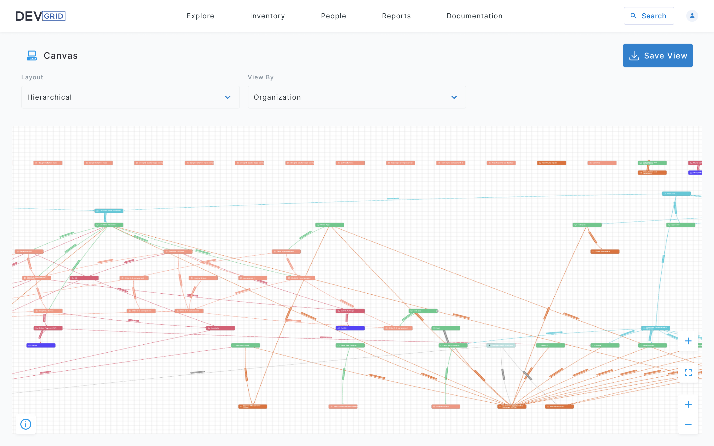
Canvas
An interactive system graph where users can explore service relationships, ownership mappings, and dependency chains — enabling teams to visualize the full blast radius of a change or incident.
Iteration 1
First Concept
The first iteration used a full-canvas hierarchical graph showing all system nodes and dependencies at once. Layout and View By controls sat above the canvas in a minimal toolbar. While the graph effectively communicated the full scope of connections, the density of nodes and crossing edges made it difficult to focus on specific services.
Client Feedback
Based on client review, the design was refined to give users more control over what they see on the canvas. The global view was too overwhelming for day-to-day use — users needed a focused starting point with the ability to drill into dependencies from there.
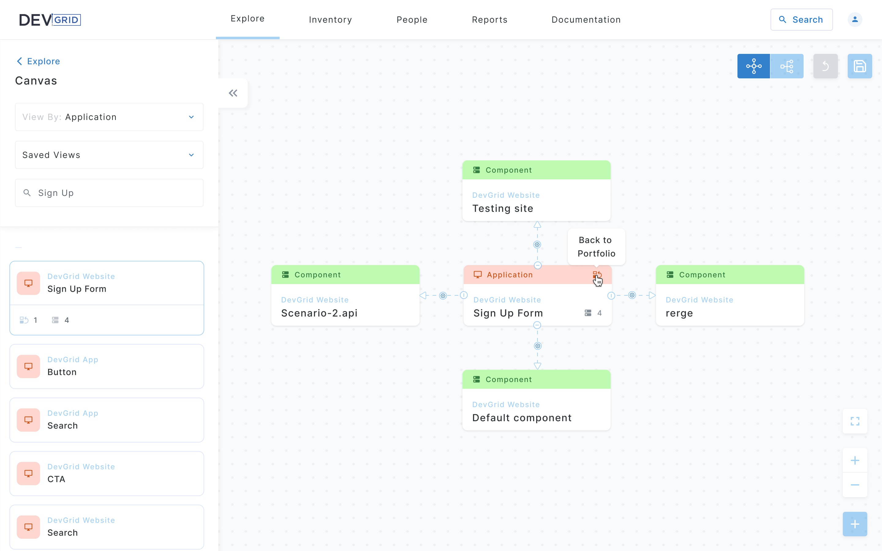
Iteration 2
Refined Based on Feedback
The second iteration introduced a focused default state — users land on a clean canvas with a searchable left panel listing components by application. Selecting a node expands its direct dependencies in context, reducing cognitive load. View By and Saved Views filters were moved to the side panel, and graph controls were consolidated into a compact toolbar in the top right.
Prototype
Interactive Prototype — Canvas
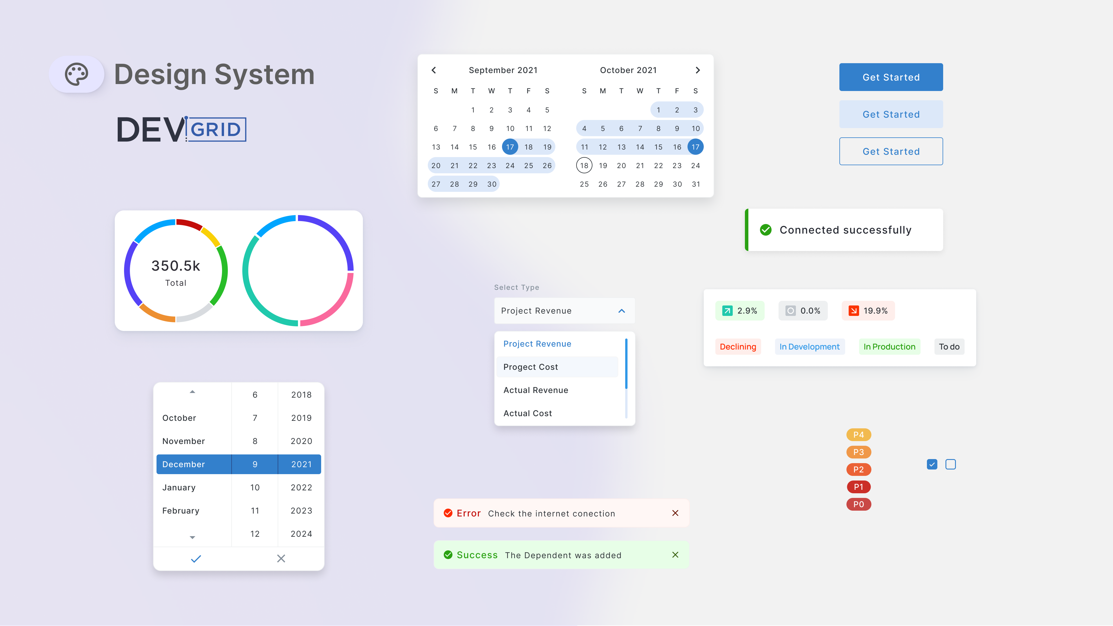
Component Library
A reusable set of components built to support the full platform — including date pickers, data visualizations, dropdowns, status badges, and toast notifications — ensuring consistency across all views.
Outcome
Result
Through an iterative design process, the platform evolved from rough initial concepts into a polished, production-ready interface. Each feature went through multiple rounds of client review and refinement, resulting in a design system that could scale across the platform.
The client received complete Figma files with interactive prototypes, annotated screens, a component library, and documented flows — everything needed for a smooth development handoff.